


TRIWA's New Visual Design
In the beginning of November, TRIWA launched a new website with a new design. It shifted from a white/black design with geometrical lines to natural pastel colors and softer fonts. Why did this change take place? And why now?
New Watch Setting the Feel for a New Era
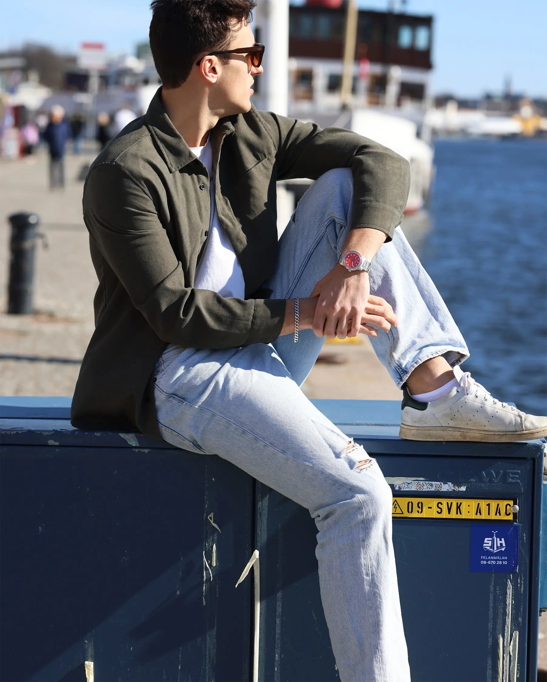
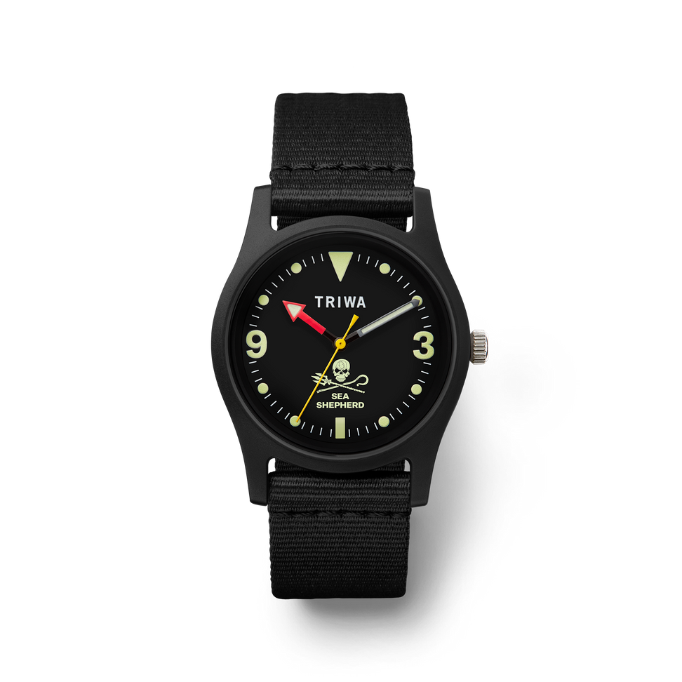
At the same time the new website was launched, a new watch model was introduced. The Koster watch is a GMT piece that combines sleek Scandinavian design and an adventurous feel through its dial, made from ocean-bound plastic.
The watch acts as a flagship for TRIWA's new phase: adventurous and energizing design that meets robust quality, all mixed into a sleek, minimal finish.
Natural Pastel Colors
During the website launch, 4 new colors were introduced: a forest green pastel color acting as our main color, a brown bark pastel color acting as our button color, and a very bright lemon cream color acting as the background and box background. These colors remind us of the Nordic landscape and connect back to our Swedish roots. Giving TRIWA a more soft, warm, and natural feeling that aligns with our focus on inspiring our community to go outside, venture, and take care of their surroundings.
A new font was also introduced during the launch of the new website. Our text font has been changed to Gill Sans, a more detailed font that complements our Montserrat headings in a balanced and fun way.
These changes has resulted in the new TRIWA visual design: a clean and simple interface combined with a natural feel.